Project Popcorn: Post Processing Part One
 Last time we covered shooting the image, this time we’ll cover the first half of post processing, specifically how I blended images to address the depth of field short comings of shooting at f/8 and the processing done in Lightroom 2 to add punch.
One of the reasons that I put so much effort into getting things correct in the camera is it cuts down considerably on the amount of work that needs to be done in post processing. Though you’ll never completely avoid post processing, the less you have to do, the better off I think you are.
After the jump we’ll cover what I used for default processing settings in Lightroom, as well as how I blended images in Photoshop to get what I wanted in focus, in focus. As well as how I tweaked things back in Lightroom to get the color and punch I wanted.
Tethered Shooting and Default Processing
One thing shooting tethered does is allows for the quick application of standard sharpening and processing to the image as I’m shooting them. There are two ways to go about applying processing settings when using Lightroom’s auto import. The first is though Lightroom’s camera defaults, the second is though a develop setting set in the Auto import settings dialog.
Both methods are certainly useful; however, for this project I choose to only use the camera defaults since I wasn’t going to do any further processing on the laptop and didn’t know exactly how I intended to process things.
If I had wanted to apply some serious processing effects, like say make the images highly saturated B&Ws or look like Velvia film, applying a development preset would have been more appropriate.

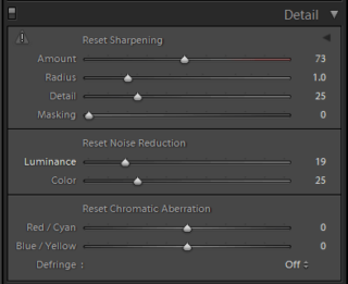
Since I hadn’t configured the laptop for the 1D-III yet, I did have to setup my defaults for it first. My basic default configuration is to set the sharpening and color profile. For the mark 3 I set the Details pallet as shown to the right. Next, I insure the profile box in the “Camera Calibration” pallet is set to Adobe standard, which I use as my reference profile.
This isn’t necessarily the best or only setting, it’s only what I find works well in my situation with my camera and lenses.
Finally, to save the settings as default you can either use the “Set Default Settings…” option under the Develop menu, or simply holding alt (option on Macs) and clicking the button labeled “Set Default” in the lower right corner of the right pane.
Editing
In my opinion, editing is what separates the boys from the men. A mediocre photographer who rigorously sorts the chaff from the wheat will usually present a better portfolio than a great photographer who can’t or won’t edit his work.
Even in this case, where the shot was directed towards a goal, there was still some editing to be done. I ended up with about 10 final frames with minor differences in subtle placement of some of the popcorn and focus.
I knew from looking at the shots as the loaded while shooting and from experience that working at f/8 wasn’t going give me enough depth of field to keep both of the popcorn containers in sharp focus. What I would need is two images, one with the front container in sharp focus and one with rear container in sharp focus.
Blending two Images in Photoshop
With the two images selected, it was time to do some tweaking in Photoshop. I could have done some light room work first, but by combining the images in Photoshop I save having to try and sync changes across slightly different images. This is more or less straight forward due to the hard edges involved.
Below is more or less what I did to blend the two images. For projects with soft objects or those with irregular surfaces more advanced masking techniques
Step 1: Open the two images in Photoshop.
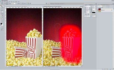
Step 2: Use quick mask, or the lasso selection tool to select the area around the subject you want and use copy and paste to insert it into the second document. In this case I’m copying the sharper front container and pasting it into the image with the sharper rear container.

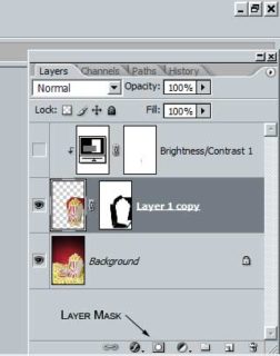
Step 3: Create a layer mask on the new layer by selecting the layer and clicking the layer mask icon at the bottom of the layers pallet.

Step 4: Switch to the layer mask by clicking on the layer mask thumbnail and begin painting the mask in black to hide the area around the subject we don’t want to show. For this, I used the polygonal lasso tool to select along the edges of the container, and feathered them by 1px to fill the bulk around the container and the paintbrush with a fairly hard edge around the rest.
Remember in masks black hides completely, white shows completely and the shades of gray in between reveal (or hide) what they cover partially.
Step 5: In this case, there was also a minor shift in lighting between the two images; this resulted in the pasted container having a slightly darker appearance than the original. To correct this I added a contrast/brightness adjustment layer used the clipping mask feature (alt-left-click the border between the two layers to clip to the top layer to the bottom one) to adjust the new container without adjusting everything or adjusting the layer permanently.
That’s all the processing that was done in Photoshop to blend the two images. I know this is a bit light on details because the actual steps will vary to some degree from image to image depending on what is being blended.
Back to Lightroom to add some Punch
The product is now at least in focus where I want it to be, but there are still some things that can be cleaned up and a bit more punch can be added.
First cleanup, there are a few spots on the background that show up as less than pleasing out of focus blurs. These are quickly taken care of with the clone tool set to heal in Lightroom.
Now to fix a couple of small issues, the very bottom of the background just above the popcorn isn’t quite the right red (it’s a bit more violet either due to over exposure or light leaking around the gel on the flash). This is corrected by using the hue slides in Lightroom to shift that color a bit more towards red. In addition, I want the popcorn will look better if it was a tiny bit more saturated, so up goes the yellow saturation slider.
Adding some contrast, contract controls the difference between bright and dark areas; higher contrast in this case will make the darks a bit darker and the brights a bit brighter. Lightroom presents a couple of ways to change the overall contrast, you can use the slider in the basic pallet or you can adjust the tone curve in the Tone Curve pallet.
 |
 |
Because I’m now working on a TIFF from Photoshop by default the tone curve is set to linear, so it reflects the image properly as it came from Photoshop. For this, I want to tweak it a bit so I changed the tone curve from linear to medium contrast.
Punch; well that’s what Adobe’s engineers called the clarity tool before marketing toned down the name at least. In this case, though, I want to use clarity’s local contrast boost to add some punch to the image to about +21.
With that, we come to the end of our first round of post processing. From here, the image is ready to print. The key things to take away are by controlling as many elements as possible during the shoot post-processing can be reduced. Had I had some more powerful lighting or a tilt-shift lens, I could have even avoided the blending step even further simplifying post processing.
What’s left to do? Well I was originally planning to add a “neon” style banner that says hot popcorn and after that is printing. So, that will be next time.