My mom is in the slow process of redecorating her movie room; she’s decided she wants to hang “snack bar” posters reminiscent of what you might expect at an old time theater snack bar. What that means, as both photographer and son, the task more or less ends up to me to design and create the images. Not that I mind.
The concept I was presented with was to have a series of images of various foods, pop corn, soda, candy, that are styled as snack bar ads. Following that I’m envisioning capturing the elements that most evoke. Each image will carry a theme and color-scheme complementary to both the overall theme and the subject in each image.
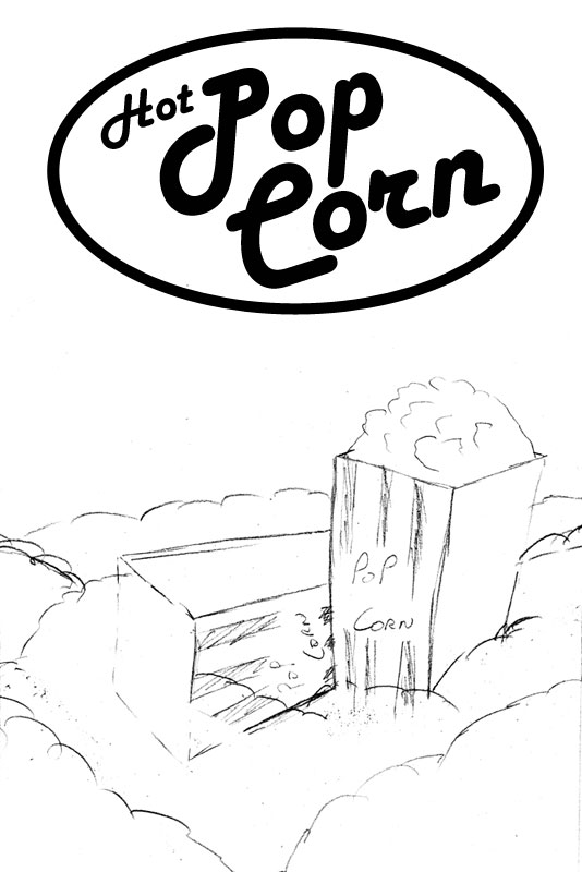
I’m starting with the pop-corn poster, which I envision will look like the concept sketch to the right (no, drawing isn’t my strong suit). The subject matter is dominated by yellows, reds and white, so I’m thinking I’ll work with that color pallet for the image I’ll complement and accentuate the red stripes on the popcorn containers with a red background. Tint my main light to warm up the yellows in the popcorn. I think, red and yellow will also work well as popcorn is suppose to be warm and buttery (also yellow) and red and yellow carry that connotation as well.
I’ve broken the image into it’s 3 key layers. For the foreground, I’m thinking out of focus popcorn to frame the main scene and evoke a bit of the feel of a popcorn machine. The main scene will be two popcorn cartons overflowing in a sea of popcorn. Finely the background will be a nice red gradient falling off as it progresses away from the scene.
I’m expecting the real challenge to be lighting this. I’ll be working with only 2 speedlites and not much to go by in the way of proper light modifiers. My overall goals are to provide even lighting without any harsh shadows, while dealing with any spill not having a proper softbox will create.
Initial Lighting Design Concept
The background will be lit by a 430Ex on a light stand directly behind the scene. It will be gelled red and probably zoomed to 70mm give or take. If everything is centered right, it should give me a nice symmetrical falloff on the background giving me darker corners. Which is what I’m looking for.
The main light will be my 580Ex pulling double duty, being triggered by a pocket wizard and triggering (by way of master mode) the 430 ex slave. I’m thinking I should probably gel it between half and quarter CTO to warm up the popcorn and cartons. I’m expecting it to be slightly to camera left, and above the camera shooting though a diffusion screen. That should take care of most of the shadow issues. The rest, if necessary, will be taken care of by large fill cards on either side of the scene.
Of course the technical challenges are only compounded by the budget, of which there is none to speak of. I suspect I’ll be pulling some serious Strobist style hackery to get what needs to be done, done. Who knows maybe something creative and useful will come out of solving problems as the come up.
From start to finish it took about 2 hours to get everything setup, designed, groomed, ready to go and shot. Fortunately, I already had my lighting designed so it was a matter of quickly dialing in the power settings. The real chore was herding popcorn where it needed to be.
The setup overview image below, shows the general overview of the setup I came up with. The background was a readily available blanket that I tend to favor when I need a dark background to paint with light. It has raised ribs in it so the background takes on some texture but doesn’t overwhelm the image.
Setup Overview
The popcorn scene was setup (well it had been taken down when I shot the setup shot) on a piece of black corrugated plastic (so as not to get a sheet of foam core all buttery). That was placed on top of a tub (seen on the couch) to raise it a bit higher and give me some room to work and hide one of my two flashes under and behind the subject. Having the second flash on the table turned out to be helpful, as I was one lightstand short of what I needed.
Now to dial in the light; this turned out to be my biggest limiting factor in many ways. I started with the main light at 1/16th power and the background light at 1/8th power. Since the 580Ex II is about a stop more powerful than the 430Ex; at equal powers the flashes will have a 1:1 ratio between them even though they are set differently.
I’m often asked how I figure out my exposure settings–aperature and shutter speed–for any given shot…
See how after the jump…
Lighting Tests
How I Figured Out What Settings to Use
The first thing you have to consider is what your most important exposure setting is. Are you shooting a static subject from a tripod? Or are you shooting moving things hand-held?
I’m often asked by people how I figure out what aperture or other exposure setting I should use for a given shot. So I’ll walk thought that here as this is an interesting case due to complexity and power limits.
The largest factor in producing this image is depth of field. I need certain things to be in focus, like the popcorn in the upright container and the two labels that say popcorn. Since I don’t have a tilt-shift lens that would allow me to control the placement of the area of sharp focus with out stopping down I’m forced to stop down to a narrower aperture.
I don’t have to worry about shutter speed for a number of reasons. They are in no particular order, I’m shooting from a tripod, the scene is static, and the scene is completely lit by strobes. Since the strobes contribute all of their light in a very short period, I can use the highest shutter speed that allows everything to sync. In this case because I’m triggering a master flash with old style non-TTL Pocket Wizards and workout outside of the design of Canon’s wireless flash system (see note) the highest flash speed I can use is about 1/100th of a second. Therefore, that’s my shutter speed.
For this shot I started by picking an aperture, I think it was f/16 and taking a test image. It was dark. Time to start increasing the flash powers.
I started with the dimmest and least powerful flash, the 430ex on the background. When that got to full power and I still wasn’t getting any appreciable glow on the background, it was time to start opening up the aperture. Two stops down to f/8 and we were getting there.
At this point, I was starting to open my aperture enough that I was concerned about depth of field being a problem. The only thing to do now is increase the ISO. In the case of this shot, I ended up at with ISO500 giving me the background illumination that I wanted. Camera settings ended up being 1/100th, f/8, ISO 500.
Now for the key light; it’s simply a mater of dialing the power of the key light up or down to get the proper exposure on the foreground elements. I lucked out here, as that ended up being exactly where I had the flash set, 1/16th power.
In the case of this shot, the aperture was limited by the performance of the lowest power flash. If I had a second 580Ex II back there, I could have stopped down a stop further due to the power difference.
a lesson in balancing dis-similarly powered flashes and being aware of the transmission factors of your gels if you’re using them.
This goes as a lesson in balancing dis-similarly powered flashes and being aware of the transmission factors of your gels if you’re using them. The key light was set four stops below full power, while the background flash was set at full power. One of those stops is accounted for in the difference between flash powers, the other three are due to the Rosco Storaro red gel that was used to color it. It’s my favorite color so far for getting a rich saturated red; unfortunately, it eats three stops of light.
Sculpting the Scene
With the lighting setup, it was time to get to the actual fun part, placing individual popcorn kernels. I knew ahead of time I wouldn’t have enough popcorn to make the whole scene I wanted form popcorn alone. So I had to add a lot of filler. In this case, the filler was printer paper.
I started by crumpling sheets of paper to fill the bottoms of the containers and form the cores of the hills of popcorn. Then I covered the tops of the hills with crumpled but smoothed out paper.
Adding Popcorn
The final step in preparation was to add and arrange the popcorn. It had cut off only a corner of the bag of popcorn so I had some control while pouring it. However, it turns out where ever I didn’t have a lot of tabletop or a paper dam installed popcorn inevitably fell off the table and went everywhere, “cleanup on isle 1”.
I shot this tethered, with Lightroom auto importing the images. The big preview with a full RAW histogram was definitely helpful in insuring I had the right exposure dialed in, as the in-camera histogram is often not quite as helpful as it would seem.
The scene was shot at 33mm, on my 1.3x crop 1D mk.3 that worked out to 43mm or just a smidge on the wider-than-normal side. I was a little surprised at this, but the tests at longer focal lengths didn’t work out nearly as well.
The remainder of the time was spent moving individual kernels around until I had no obvious holes in the field of popcorn, the right patterning in the “hills” and a properly full container.
All told, I shot about 60 frames to get everything dialed in and nailed, including some with the focus adjusted to varying positions just in case (this actually was very important).
How Things Could Have Been Easier
What could have made things easier? Well for starters, a second 580Ex for the background light, it would have given me a stop narrower aperture, so I would have been shooting at f/11 and not f/8.
Moving up a step from that would have been the jump to full studio strobes with modeling lights. With the limitations I had on shutter speed, controlling the ambient light levels was important to keeping them from influencing the scene unexpectedly. The modeling lights and flash power has two advantages. More flash power, especially for the background light, would directly translate to a narrower aperture and more depth of field. Second, the modeling lights would allow the scene to be brightly illuminated for focusing and composition and then only lit by the strobes for the actual exposure.
All in all though, I’m happy with the results given the time, conditions and equipment I had available to work with.
Last time we covered shooting the image, this time we’ll cover the first half of post processing, specifically how I blended images to address the depth of field short comings of shooting at f/8 and the processing done in Lightroom 2 to add punch.
One of the reasons that I put so much effort into getting things correct in the camera is it cuts down considerably on the amount of work that needs to be done in post processing. Though you’ll never completely avoid post processing, the less you have to do, the better off I think you are.
After the jump we’ll cover what I used for default processing settings in Lightroom, as well as how I blended images in Photoshop to get what I wanted in focus, in focus. As well as how I tweaked things back in Lightroom to get the color and punch I wanted.
Tethered Shooting and Default Processing
One thing shooting tethered does is allows for the quick application of standard sharpening and processing to the image as I’m shooting them. There are two ways to go about applying processing settings when using Lightroom’s auto import. The first is though Lightroom’s camera defaults, the second is though a develop setting set in the Auto import settings dialog.
Both methods are certainly useful; however, for this project I choose to only use the camera defaults since I wasn’t going to do any further processing on the laptop and didn’t know exactly how I intended to process things.
If I had wanted to apply some serious processing effects, like say make the images highly saturated B&Ws or look like Velvia film, applying a development preset would have been more appropriate.
Details Pallet defaults for my EOS 1D Mark 3
Since I hadn’t configured the laptop for the 1D-III yet, I did have to setup my defaults for it first. My basic default configuration is to set the sharpening and color profile. For the mark 3 I set the Details pallet as shown to the right. Next, I insure the profile box in the “Camera Calibration” pallet is set to Adobe standard, which I use as my reference profile.
This isn’t necessarily the best or only setting, it’s only what I find works well in my situation with my camera and lenses.
Finally, to save the settings as default you can either use the “Set Default Settings…” option under the Develop menu, or simply holding alt (option on Macs) and clicking the button labeled “Set Default” in the lower right corner of the right pane.
Editing
In my opinion, editing is what separates the boys from the men. A mediocre photographer who rigorously sorts the chaff from the wheat will usually present a better portfolio than a great photographer who can’t or won’t edit his work.
Even in this case, where the shot was directed towards a goal, there was still some editing to be done. I ended up with about 10 final frames with minor differences in subtle placement of some of the popcorn and focus.
I knew from looking at the shots as the loaded while shooting and from experience that working at f/8 wasn’t going give me enough depth of field to keep both of the popcorn containers in sharp focus. What I would need is two images, one with the front container in sharp focus and one with rear container in sharp focus.
Blending two Images in Photoshop
With the two images selected, it was time to do some tweaking in Photoshop. I could have done some light room work first, but by combining the images in Photoshop I save having to try and sync changes across slightly different images. This is more or less straight forward due to the hard edges involved.
Below is more or less what I did to blend the two images. For projects with soft objects or those with irregular surfaces more advanced masking techniques
Step 1: Open the two images in Photoshop.
Step 2: Use quick mask, or the lasso selection tool to select the area around the subject you want and use copy and paste to insert it into the second document. In this case I’m copying the sharper front container and pasting it into the image with the sharper rear container.
The area in red on the right hand image is what will be copied and pasted into the lefthand image.
Step 3: Create a layer mask on the new layer by selecting the layer and clicking the layer mask icon at the bottom of the layers pallet.
I use a lot of margin in my selection and then mask off what I dont want as it gives much better control over how the layers blend.
Step 4: Switch to the layer mask by clicking on the layer mask thumbnail and begin painting the mask in black to hide the area around the subject we don’t want to show. For this, I used the polygonal lasso tool to select along the edges of the container, and feathered them by 1px to fill the bulk around the container and the paintbrush with a fairly hard edge around the rest.
Remember in masks black hides completely, white shows completely and the shades of gray in between reveal (or hide) what they cover partially.
Step 5: In this case, there was also a minor shift in lighting between the two images; this resulted in the pasted container having a slightly darker appearance than the original. To correct this I added a contrast/brightness adjustment layer used the clipping mask feature (alt-left-click the border between the two layers to clip to the top layer to the bottom one) to adjust the new container without adjusting everything or adjusting the layer permanently.
That’s all the processing that was done in Photoshop to blend the two images. I know this is a bit light on details because the actual steps will vary to some degree from image to image depending on what is being blended.
Back to Lightroom to add some Punch
The product is now at least in focus where I want it to be, but there are still some things that can be cleaned up and a bit more punch can be added.
First cleanup, there are a few spots on the background that show up as less than pleasing out of focus blurs. These are quickly taken care of with the clone tool set to heal in Lightroom.
Now to fix a couple of small issues, the very bottom of the background just above the popcorn isn’t quite the right red (it’s a bit more violet either due to over exposure or light leaking around the gel on the flash). This is corrected by using the hue slides in Lightroom to shift that color a bit more towards red. In addition, I want the popcorn will look better if it was a tiny bit more saturated, so up goes the yellow saturation slider.
Adding some contrast, contract controls the difference between bright and dark areas; higher contrast in this case will make the darks a bit darker and the brights a bit brighter. Lightroom presents a couple of ways to change the overall contrast, you can use the slider in the basic pallet or you can adjust the tone curve in the Tone Curve pallet.
The image after blending in photoshop.
The image after tweaking in Lightroom.
Because I’m now working on a TIFF from Photoshop by default the tone curve is set to linear, so it reflects the image properly as it came from Photoshop. For this, I want to tweak it a bit so I changed the tone curve from linear to medium contrast.
Punch; well that’s what Adobe’s engineers called the clarity tool before marketing toned down the name at least. In this case, though, I want to use clarity’s local contrast boost to add some punch to the image to about +21.
With that, we come to the end of our first round of post processing. From here, the image is ready to print. The key things to take away are by controlling as many elements as possible during the shoot post-processing can be reduced. Had I had some more powerful lighting or a tilt-shift lens, I could have even avoided the blending step even further simplifying post processing.
What’s left to do? Well I was originally planning to add a “neon” style banner that says hot popcorn and after that is printing. So, that will be next time.