Testing and Acclimating to a new Camera
A new camera is always exciting to get your hands on, at least it is for me. While I will definitely run out side and start shooting some random stuff — because, well, new shiny — before I put the camera into any kind of serious use, I run though an acclimation and calibration process of sorts. Part of this is to get develop defaults setup for Lightroom, but a lot of this is just to get a feel for the performance of the camera.
If you don’t care about the theory, skip to download the test chart.
The New Camera Acclimation Process
The first obvious question is, what do I mean by acclimating to a new camera and why do anything special?
Back when film was the medium, getting a new camera didn’t change the performance of your images. Kodachrome was Kodachrome, regardless of whether you shot it in a Nikon F4 or a Canon EOS 1V.
With digital, the image performance is a product of the sensor. That means that with each new sensor the resolution, dynamic range, and noise characteristics change. As a result the capabilities in terms of resolving power and image quality will change from camera to camera.
While most of these changes are small from generation to generation, if you’re not regularly upgrading and keeping all of the available platforms the change can be pretty significant.
Beyond just getting a feel for a new camera, if you use Adobe’s software for raw conversion, either Lightroom or CameraRAW and Photoshop, the raw engine supports the capability of specifying camera and ISO specific defaults that you can use for noise reduction and sharpening. Having those defaults setup means a bit less work needs to be done on images after you import them.
I’ll be focusing more on the Lightroom default setup in a future article following this one.
My experience with both trying to figure out my camera, and with trying to tune image performance in Lightroom have slowly lead me towards developing the process and target I’m going to discuss in the rest of this article. Suffice to say, I don’t claim this is ideal or even necessary for everyone, but I find it helps me.
The Acclimatization and the Lightroom Defaults Target
When I first started building Lightroom ISO specific defaults, I simply pointed the camera at whatever I had handy, like a clear wall or a bookshelf, and shot an image at every ISO. Over time, its become increasingly clear though that a more methodical approach is necessary to get the best results instead of just guessing a lot.
With that in mind I started looking for a good target I could use to generate images that would provide meaningful information that I could use to make intelligent ISO defaults. My early attempts utilized an ISO 12233 target I found online. However, that did’t quite cover all of my needs and points so I started designing my own.
My needs for an acclimatization target broadly fall in three ares.
- I want fine, or at least, relatively fine detail that I can observer to see how noise, and therefore sharpening and noise reduction, will affect the images I’m shooting.
- I want a step wedge of some sort to be able to determine how dynamic range is being affected by noise.
- Finally I want some color targets to be able to determine if there are any specific issues with noise in the primary colors, or in approximations of typical colors one might expect to photograph.
To accomplish those ends, I’ve combined and expanded on some of the standard ISO 12233 resolution patterns, and added to the target a number of color patches that can be used to evaluate dynamic range and color noise.
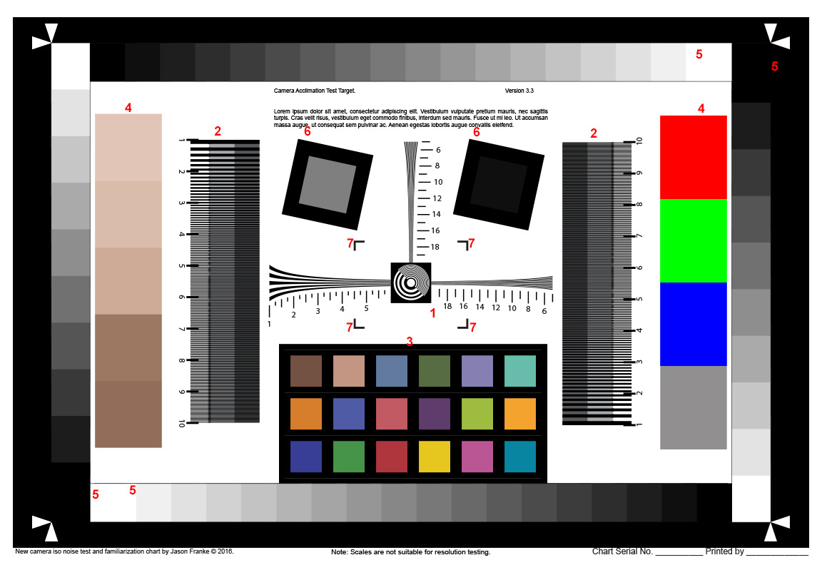
I’ve numbered the various elements in the target shown above and described their intent below.
(1) Central “Resolution” Targets
While I keep reiterating that this isn’t a resolution target, what I really mean is that it’s not a calibrated absolute resolution target.
With a proper ISO 12233 target, and a camera lined up with the proper registration marks, the numbers along the various lines represent the resolution in 1000s of line pairs per picture height. When tested properly, and with a proper target, you get an absolute resolution for the lens and camera that can be compared between different lenses and cameras.
For example, you can compare the resolution data show in the test targets used by The Digital Picture with the resolution numbers published by say DXOMark.
I’ve attempted to scale the resolution of the test patterns so that it will be usable to determine (remember this isn’t calibrated) resolution of a 3:2 aspect ratio camera. Line the frame corners up with the points of the white triangles in the corners.
Note: Using this target for resolution measurements will not be as accurate as, and isn’t a substitute for, a properly calibrated ISO 12233 target exposed under proper test conditions.
Use this element to judge the effect of noise on rendering fine details and with adjusting sharpening.
(2) Contrast Limited Resolution Blocks
There are two vertical “contrast limited” resolution blocks. These are intended to look at the effect of noise on lower contrast lines.
These can roughly be though of how will detail be held or lost as the subject matter moves into the darker parts of the exposure.
Use this element to judge the effect of noise on the rendering of fine details at various contrast levels.
(2) Color Check Block
X-Rite’s color check block is a rather well thought out test card for camera color performance. The basic break down of colors is such that it generally tends to try and capture colors that are generally found in photographs. So it’s good indicator of color performance of a camera.
However, I want to underscore a point here. This will not make you a color check card that can be used to build DNG profiles or validate a camera’s color performance. Even if in you print this with a perfectly calibrated printer, the spectral response of the inks in the printer will vary from the those of the color check card and therefore the colors may either not match exactly or shift in unpredictable ways under different lighting.
The intent here is to provide a set of color samples that can be used to judge noise performance and not color quality or performance.
For those who are unfamiliar with the X-Rite color check card the colors are roughly as follows.
| Colors | |||||||
|---|---|---|---|---|---|---|---|
| Natural Colors | Skin Tone | Skin Tone 2 | Blue Sky | Green Foliage | Blue Flower | Blueish Green | |
| Misc. Colors | Orange | Purple Blue | Moderate Red | Purple | Yellow Green | Orange Yellow | |
| Primary Colors | Blue | Green | Red | Yellow | Magenta | Cyan | |
For this chart the gray scale ramp has been removed as there are other gray scale step wedges around the chart.
The color sample block on this target measures roughly 5.25 x 2.75 inches. An X-Rite Color Check Passport measures around 5 x 3.5 inches. If you wanted to superimpose the actual card in front of the test target it would cover up part of the step wedge on the however, I don’t see this as a significant issue.
Use this to judge the effect of noise (and noise reduction) on various colors.
(4) Large Color Blocks
Like the color check card block these blocks of color are intended to be used to look for artifacts related to noise reduction and noise in primary colors.
The RGB block on the right side of the target, are fully saturated sRGB colors. The intent is to see if there are specific noise problems with any of the color primaries.
The 5 color ramp on the left side of the test image are skin tones as suggested by Adobe Illustrator.
Use this to judge the effects of noise (and noise reduction) on various colors.
(5) Gray Scale Step Wedges
There are 4 grayscale step wedges around the periphery of this chart. The side two have 10 steps, the top and bottom 2 have 18.
Since most printers only have a contrast ratio of 250:1 or so, these may not reproduce completely and almost certainly won’t represent stops or any meaningful value. That said, as noise increases and dynamic range falls off, less and less of the steps will remain distinct.
This is intended to aid in judging dynamic range.
(6) Dark Gray Blocks
These are two solid gray blocks (middle gray left, dark gray right) ringed with a black border. These can be used like the gray scale wedges to evaluate the performance of the shadows and nose there in.
In addition the blocks are rotated at 12.5° angle so the black edges can be used to compute the resolution of the lens/camera using the Slant Edge Spatial Frequency Response (SFR) technique.
These are intended to be used for measuring resolution using the slant edge SFR technique and to determine dynamic range performance.
(7) Sharpening Halo Test Angles
The four L-shaped blocks around the center of the target are intended to provide a high contrast edge to judge the potential for over sharpening in Lightroom. The high contrast and narrow edge can cause haloing to occur at high sharpening values as there is no real headroom for the edge’s contrast to be increased.
These are intended to be used to judge possible over sharpening.
Printing the Target
The target overall is 16 by 11 inches at 100% magnification, so it can be printed on a 12×18 print form pretty much any lab, or on any of the home A3+ (13×19) photo printers.
Ideally, you want to print this on high gloss paper as that tends to have both the best resolution capabilities and highest possible contrast ratios.
On my Canon printer I use Canon’s Photo Paper Pro Platinum for this. I’m not familiar enough with Epson’s offerings to know what to recommend there. Though any high quality gloss photo paper should work fine.
Based on my current understanding of rendering intents, I believe that this should be printed using the relative colorimetric rendering intent.
Remember, even with a good color managed workflow it’s highly unlikely that any of the colors in the test target will reproduce exactly. This is especially true for the color check boxs, which will not be reproduced with the same spectral response as the inks used by X-Rite in their target. You may get close, but this not intended to be a replacement or substitute for proper color management hardware.
Mounting the target to a stable perfectly flat substrate, like a sheet of glass, is not necessary for the acclimatization process.
I’ve provided two versions of the target for download. One is a vector based PDF saved directly from the Illustrator file. If you know how to print this at high resolutions, this file should provide the best quality. Alternatively, the second choice is a 600 PPI PNG–24. This is much easier to get decent prints from using Photoshop or really any photo printing software.
Usage Overview
The following sections cover in more detail the though process and conditions that are best to get the most out of this target. Here I’m going to just cover the brass tacks of using it.
- Mount the target to a flat surface, e.g. a wall, or door
- Light the target evenly, try to minimize specular reflections as much as possible (if possible use photographic continuous lighting CFL or LED is fine as long as they are full spectrum).
- Align the camera with the target (this isn’t super critical just try to get it close)
- Focus on the target using live view, high magnification, or contrast detection AF (best if good light is available)
- Turn off the AF system, and image stabilization system
- Meter the target such that the white paper is in the brightest stop but not clipping
- Photograph the target from the lowest ISO to the highest ISO adjusting the shutter speed to keep the exposure correct.
- Review the images.
Lighting
When I started doing this kind of acclimation testing I used whatever ambient light was available and made no special attempt to control spill. While this can be done workably, it does undermine some of the potential of the testing.
First, unless you happen to have daylight to work with, often times the camera’s auto white balance settings won’t be able to fully correct of the light’s color temperature. In my thinking at the time, this wasn’t a real consideration because I wasn’t looking to judge color quality. However, at high ISOs many cameras can develop magenta or green color casts.
This leads to the problem with having uncontrolled and uneven illumination as far as color casts go. One of the things you can control in Lightroom is the green/magenta tint of shadows. If your camera has a magenta cast in the shadows at high ISOs, then you can tweak that setting to compensate for that. However, if you have no control over the lighting, especially as the ISO is increased, you can pick up all kinds of crazy casts. Especially if the room lighting is relatively equal in intensity.
For example, I have a pair of daylight balanced LEDs behind my computer’s monitors to provide counter illumination and increase the perceived contrast ratio. The rest of my room is lit by tungsten balanced LEDs. The two sources end up being relatively balanced in intensity where I setup my test target, and so half the target that can see the daylight LED takes on a blue cast while the other half lit only by tungsten LEDs takes on an amber cast.
By controlling the lighting and limiting it to a single color, I can insure that the target isn’t picking up strange casts, and thus can use the shadow tint adjustment to fix any casts that are artifacts of noise.
Type of Light (Strobe or Continuous)
I’ve used both hotshoe flashes as well as continuous lights in the past and my experience is that continuous lights are easier to work with and far better at controlling variables when preforming these tests. At a minimum continuous lighting insures that the target is well illuminated when you’re trying to focus and setup the camera. The brighter the target is when focusing, the less noise will be visible in live view and the more accurate contrast detection AF will be if you use it.
For these tests I use a 50 W Westcott Daylight CFL(Affiliate Link) in a 24×24 inch Lastolite EzBox Hotshoe. (Note, this won’t work out of the box, I built a simple PVC adapter to allow me to use the CFL in the EzBox hotshoe.)
I recommend avoiding strobes if at all possible, and for a number of reasons.
Lets start with the first problem of power range. A camera with an ISO range of 100 to 100,000 will cover 10 stops of range.
Since a strobe is instantaneous the strobe has to be able to adjust over that whole range as well. Some large stupid strobes, like Pro Photo’s system, can cover 10 stops and do so with very accurate power control, but most can’t. Hotshoe flashes are typically even more limited; pro versions like the Nikon SB–910 or the Canon 600 Ex can cover 7 stops, and consumer oriented units often only can cover 6.
On the other hand, almost all cameras shutters can cover from 30s to 1/4000s which is 17 stops, and most higher end cameras can hit 1/8000s which is 18 stops. As a point of reference ISO 50 to ISO 3.2M on a D5, is only 16 stops of range. With a continuous light you have a much better chance of covering all of a cameras ISO range by only varying the shutter speed than you do trying to adjust flash powers to do the same.
Number and Positioning of the Lights
As far as positioning lights goes, this should be approached the same way you would approach photographing a painting or any other flat subject that needs to be evenly illuminated.
The best option is to use a pair of soft boxes aimed off axis by about 45° to provide even illumination.
That said, if you only have a single softbox (like me) you can use it without too many problems. I position my light either above or below the target far enough away to make it mostly even. By being above or below, and with as big of a source as I have, the fall off is happening across the shorter side of the target and thus is less of an issue.
In either case, remember the target is printed on high gloss paper, so you want to insure that your light is positioned in such a way that it doesn’t reflect directly off the target.
Camera and Lens Setup
I shoot all of my test images from a tripod, with the mirror locked up (live view), and using a cable release. If you don’t have a cable relate, use the self timer.
The intent is to insure that you minimize camera shake so as not to artificially distort your results.
As far as the lens goes, I use my best lens to remove as much of the lens from the equation as possible. Remember, we’re testing the camera not the lens. I will do other tests with various lenses and especially with stopping them down to see how diffraction affects the images, but those are a story for another time.
I will try to shoot at whatever I’ve determined is the sharpest aperture setting for my camera and lens is. Since this is a new camera, either check my diffraction resolution calculator or google for some reviews that note the sensor’s diffraction limited aperture and don’t shoot at an f-stop higher than that value. That said, there is a bit of a balancing act here. If your light is too bright you may need to stop down more, especially at high ISOs to cover the entire ISO range at a proper exposure. If that’s the case, try to make sure that’s happening at the highest ISO settings where noise will limit resolution far more than diffraction will.
As far as testing goes, I do my best to limit variables that change. The only two settings I adjust are the ISO and the shutter speed. This is also important since the aperture changes the optical characteristics of the lens which can lead to potentially misleading results. However, since everything is static and the camera is on a tripod, varying the shutter speed won’t create more or less motion blur.
Besides, this is a good time to verify that the shutter on your new camera behaves properly across the whole range. If you get certain shutter speeds that produce under or over exposed images, that likely indicates that the shutter isn’t timed properly at that speed — at least relative to the ISO.
Two final notes. Turn off image stabilization. Even if your lens has tripod detection it’s still desirable to insure that the stabilization system doesn’t contribute or affect the images in any way.
Secondly turn off auto focus. These images should all be shot at the same focus position so again there aren’t any potential errors throwing things off. Remember this isn’t a lens test. Focus before you shoot the first image, then physically turn the AF system off and shoot the rest.
An exception to this is if you use rear button focusing only, and the shutter release does not activate the AF system at all. In this case you don’t need to physically disable the AF on the lens, just don’t hit the AF on button again after you’ve established the initial focusing.
Testing and Basic Interpretation
Collecting the test image is straight forward. Start at the camera’s low ISO, take a picture, up the ISO a setting, repeat.
If you’re camera offers the choice between 1/2 and 1/3 stop ISO increments, I would suggest only bothering with the ones you’ll actually use. For me that’s 1/3 stop increments, and so that’s all I shoot.
Interpretation is also very straight forward at this point.
Look at the images and see what they look like. Pay attention to the resolution bars, you’ll definitely find that as the ISO goes up the resolving power will go down. With some patience you can correlate the value on the chart with detail levels you care about and us that to judge the highest ISO you want to generally use in your work.
Also pay attention to the step wedges, again you’ll find that as the ISO goes up the will lose fidelity between blocks. Unfortunately since this isn’t a calibrated target, and I have no idea what your printer’s dynamic range may be, translating the wedges into a real world understanding is a bit more challenging.
Another thing to look out for is non-uniformities in the color and noise at high ISOs. Usually this will be most obvious in the black border. Some cameras have noisier parts of the sensor that show up at especially high ISOs. For example, my 5D mark III tends towards more magenta in the lower right corner of the image at ISO 100,000 — it’s not untenable but it is something that I have to keep in mind if I want to shoot at that high of a setting.
I’ll be getting into a much more detailed explanation of how to use these test images to create camera and ISO specific defaults in Lightroom/ACR in a future post. Along with how to use a proper color check card to build camera specific DNG color profiles. For now though I’m going to leave the discussion of camera acclimation here. Personally I find this to be valuable way to really get a feel for what I can expect out of a new camera. Moreover, if you’ve never tried this kind of methodical approach to looking at your cameras performance, subjective an qualitative as it is, it may be illuminating to do so as well.
Comments
There are no comments on this article yet. Why don't you start the discussion?