X-Rite ColorChecker Passport Photo Review
For most photographers, getting the most accurate color really isn’t something that’s super critical to get absolutely right from end to end. What’s important is getting pleasing colors that make attractive images. However, for some photographers — those who do advertisements for example — having accurate color can be really important and to do that you need a calibrated standard that can be used to generate an adjustment profile to match your camera’s actual performance.
Okay sure, but I self identify as a fine art photographer, which puts me squarely in the camp of not really caring about accuracy over emotion. Of course, I do publish reviews on this site, but even then, the colors in my images being absolutely perfect isn’t my highest priority. Moreover, since the vast majority of those images are going out on the web, they’ll be viewed by people with uncalibrated monitors doing all kinds of crazy stuff to the colors. It strikes me as a bad idea to get too bent out of shape about color accuracy for them anyway.
That said, I do write a bit about the technical side of cameras and light. I can’t reliably have a discussion about the effect of something or even my perception of something, when we have no common point of reference. A calibrated color reference chart, like the X-Rite ColorCheckerer — or in this case the ColorCheckerer Passport — is that kind of reference.
That’s why I have a ColorChecker Passport, but do you need one?
Do You Need a ColorChecker (Passport)?
I think before I go any further, I ought to address this question. After all, if you know you don’t need one of these, there’s no need to continue reading.
The natural question here is, who should consider having a ColorChecker passport?
My answer to that is simple; you’ll know when you need one and don’t need someone telling you to consider getting one.
In short, there are so many other things that the $80 can be spent on that will do more for your photography than a ColorChecker card that it’s really not worth it unless you know you need one.
The long answer is a bit more detailed. One of the things that I’ve realized since getting a ColorChecker card and doing some testing with it, both at the printer end and on the camera end, is that the defaults are generally very good. My printer, to the extent that it the colors are in gamut, does a darn good job of coming pretty close to the ColorChecker card, and that’s with the Canon supplied ICC profiles. The same can generally be said to be true of my camera. Brought into Lightroom there are certainly differences between my ColorChecker Card derived DNG profiles and the Adobe supplied ones, but the differences aren’t so pronounced that they are worth making a big deal out of for most users.
So with that out of the way, I think it’s time I start talking about the ColorChecker Passport itself.
ColorChecker Passport
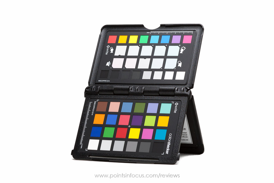
The ColorChecker Passport is the pocket size version of the X-Rite ColorChecker card, with a number of features that make it more useful in the field. These features range from size, to build, to the included targets themselves.
Overall the ColorChecker Passport is a more compact version of the full sized 8.5 x 11 inch ColorChecker card. In fact, at 4.92 x 3.54 inches (125 x 90 mm), and about 0.35 inches (9 mm) thick. That makes it almost exactly the size of a standard passport as defined by the ICAO and used by virtually all countries. If I was a betting man, I would hazard to guess that that’s where the passport in the name comes from.
The size makes it relatively pocketable unless you wear high fashion jeans or something without pockets. Even then, it’s certainly small enough to put in the easily accessible accessory pockets in most camera bags.
That said, if you’re not of the pocket inclined persuasion, X-Rite didn’t leave you hanging. Or you could say they did, as the passport is drilled in one corner for an included lanyard.
If you ask me, X-Rite’s lanyard solution isn’t quite ideal. The hole is quite small, and was clearly intended to be used with a lanyard that uses a fine line on the end and not a clip or split ring. It would be a simple prospect to drill out the lanyard hole to make it bigger, but I’m not sure that’s something I should have to do.
I believe the ColorChecker Passport comes with a lanyard. However, at the time of my writing of this my box, and probably the lanyard if there was one, has disappeared into the abyss that is my drawer of camera gear boxes and I can’t find it at the moment to confirm. I’ll update this if and when I find it again.
The overall design is very much a play on a passport. There are 3 test charts that are arranged in booklet form with the hinge on the long side. The 3 parts of the “booklet” are made out of durable ABS plastic with a proper (non living) hinge and a locking mechanism to secure the ColorChecker Passport shut. The actual test targets are printed on card stock like material that’s affixed to the plastic with some kind of adhesive.
Overall the ColorChecker Passport is quite well made and appears relatively robust. The plastic base pieces are relatively thick and sturdy. I’m sure it could be broken, but I don’t see how you’d do it without abusing it.
As I noted, the ColorChecker Passport doesn’t use a living hinge — the kind where the plastic flexes instead of there being an actual pin that’s pivoted around. As such I don’t see any durability problems with the hinge.
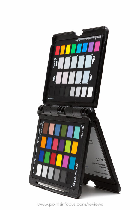
Additionally, the hinge is designed with detents to hold the passport in various positions. The panels lock open at 180°, as well as in intermediate positions around 60°. As a result, the ColorChecker Passport can be stood up on its own.
Additionally, X-Rite has included a locking mechanism to keep the ColorChecker Passport closed with out relying on the hinge alone.
Targets
The ColorChecker Passport is actually three targets in one. And this, in my opinion does make it considerably more useful than just a plain ColorChecker Card. The three targets are:
- Creative Enhancement target
- ColorChecker target
- White balance target
Creative Enhancement Target
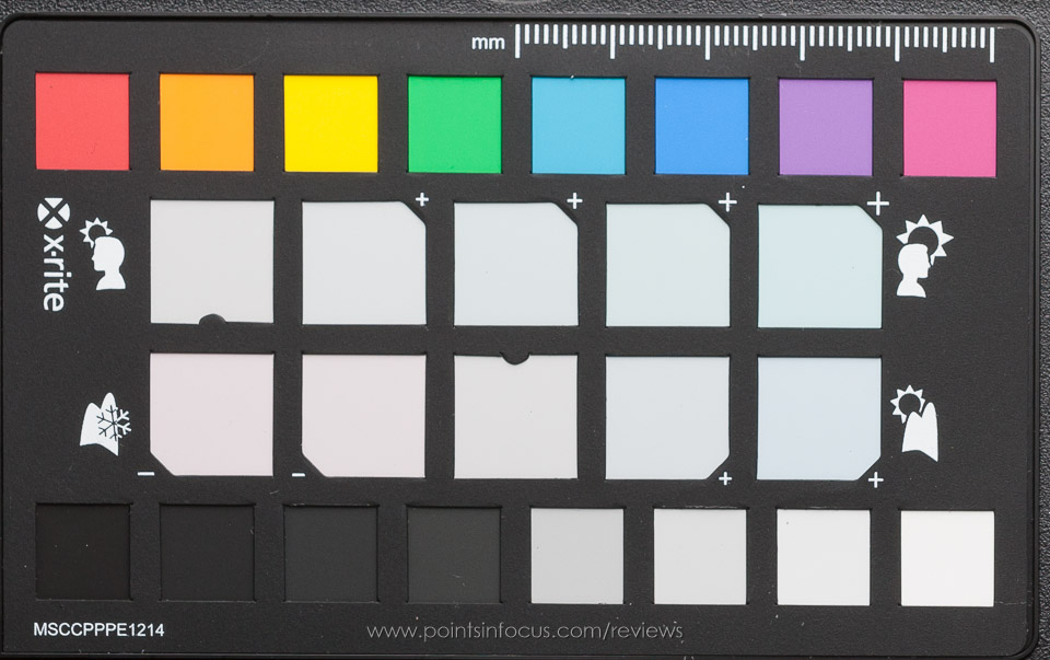
The creative white balance target provides 16 reference color and gray patches. These include 4 dark grays, 4 light grays, and standard colors from violet/purple to red.
The meat of the Creative Enhancement target though is the two 6 patch white balance adjustment sets. These are designed to be “grayish” but tinted in specific ways to make an image warmer or cooler than neutral in specific ways. They are divided into portrait and landscape options that focus on slightly different hue changes that work well with those kinds of images.
Classic ColorChecker Target
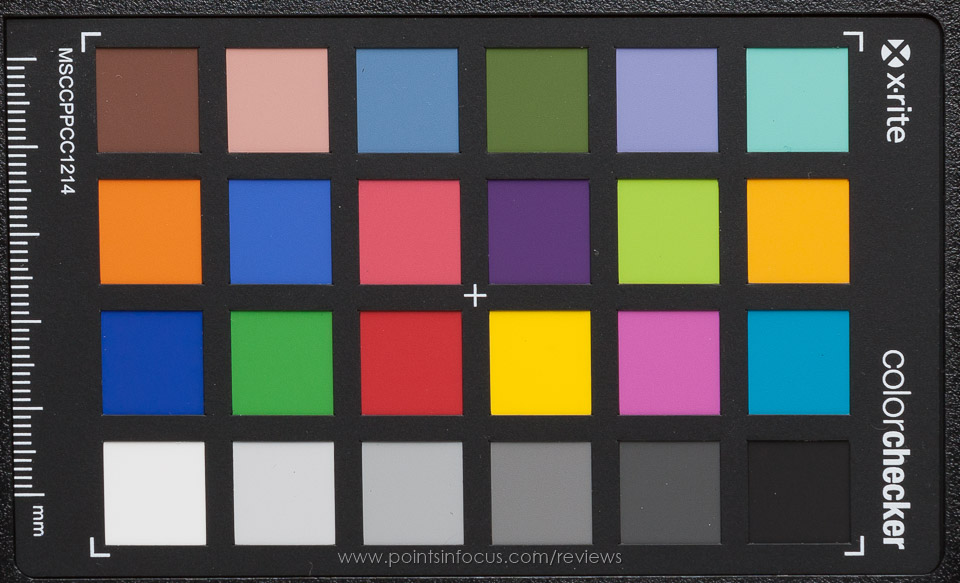
The classic ColorChecker target is the reason I bought a ColorChecker passport. It’s a 24 patch target that is designed to provide an efficient reference of colors and grays. Six patches are perfectly neutral grays ranging from “black” to “white”. The remaining 18 patches are selected based on various criteria that are useful. These include common skin tones, common colors found in nature, and the RGB and CMY primaries.
White Balance Target
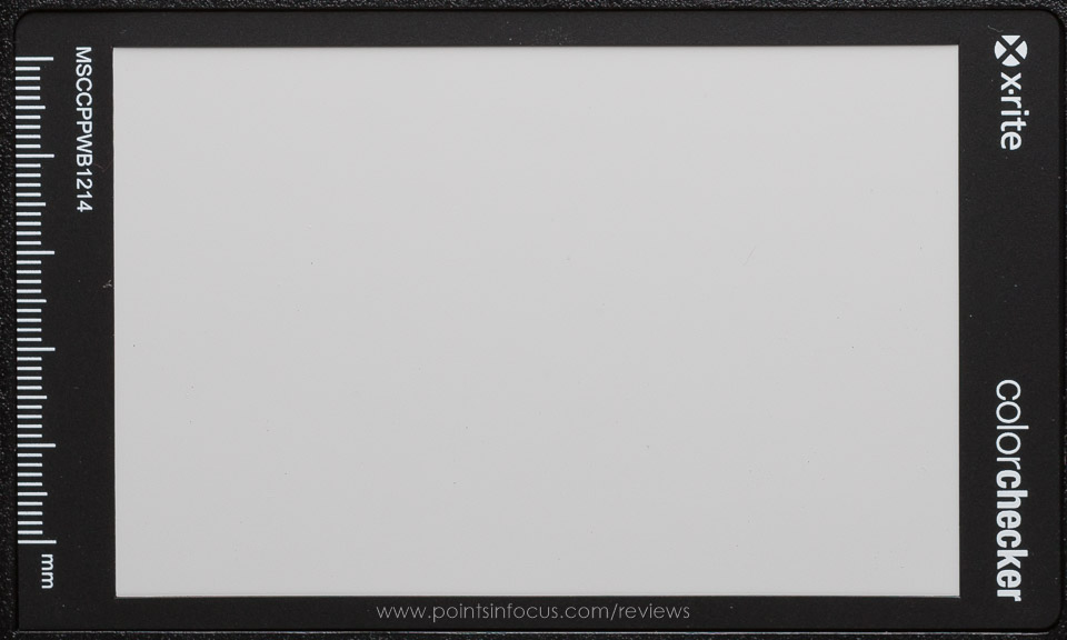
The final target in the ColorChecker Passport is a large neural OBA free light-gray white balance target. This can be photographed and used in camera to generate custom white balances or as a post production reference for correcting white balances.
I’ve written previously about the need to have an OBA free properly neutral target for white balances. This is that target.
Target Usage
If there is one point I would criticize the ColorChecker Passport on it’s that the order of the targets cannot be easily reconfigured. Okay, this is a somewhat theoretical complaint since I haven’t really needed to do this. But it still feels worth mentioning.
By default the ColorChecker Passport is organized so that the creative adjustment target and the classic ColorChecker target can be seen together, and the white balance target is on the reverse side of the classic ColorChecker target.
This is probably how most people would want to use the ColorChecker Passport, so I guess that seems reasonable. I however, don’t have a lot of interest in the creative adjustment target. That’s not to say I don’t want it in the device, or don’t want to have it with me, but I’m much more interested in the classic ColorChecker target and white balance card. Unfortunately, they’re on opposite sides of the same panel, so they can’t be photographed together.
Now admittedly, there are neutral grays that can be used or white balancing on the classic ColorChecker and creative adjustment targets, so it’s not like you can’t eye-dropper adjust with just those targets. However, they patches are relatively small compared to the full sized white balance patch.
If the targets themselves weren’t glued to the plastic, I could potentially reconfigure the ColorChecker to whatever configuration I wanted or needed. Of course, that might make it more likely that a target would be damaged or lost, so maybe that’s not a good tradeoff either. Anyway, the nature of the configuration is something that I did feel warranted some discussion.
Custom Camera Color Profiles
One of the myriad of ways that the ColorChecker Passport can be used is to build custom camera color profiles. While the profiles provided by the manufacturer or the raw conversion software (such as Lightroom) are generally pretty accurate, you can usually get a bit better with a custom profile.
As things currently stand, all of Adobe’s software that uses the Camera RAW engine (including Lightroom) support DNG color profiles that can be generated with the included software. In addition, Blackmagic Desing’s DaVinci Resolve and Hasselblad’s Phocus software support generating custom camera color profiles using the X-Rite standard target. Finally, for software that uses ICC profiles instead of DNG profiles, X-Rite provides software that can be used to make ICC profiles using the standard color check target too.
I’ve only used DNG profiles so far, so I’m going to limit my discussion to them.
There are two types of DNG profiles, single illuminate and dual illuminate. The difference between the two is that a single illuminate profile is only valid for a single light source at a single color temperature.
Broadly, single illuminate profiles require a single image of the color check target, and are really only useful for controlled situations. For example, you could build one for your studio lights, and use that for anything you shot in your studio, but it would be useless in any other situation.
Dual illuminate DNG profiles allow the software to interpolate across a range of color temperatures and lighting conditions. For these to work, you have to feed the profile creation software two different images taken under two different lighting conditions; for example, one in daylight at 5500K and another under tungsten at 3000K.
Dual illuminate profiles are more flexible, in the sense that they can be applied to a number of situations, not just the one where they were created, however they are slightly more work to create.
To maximize quality dual illuminate profiles should always be created using the same camera, lens, and ISO setting. Moreover, it’s recommended that they be made under lighting conditions where the correlated color temperature (CCT) in Kelvin in as far apart as possible. That is, it’s better to have a daylight image at 5500K and a tungsten image at 3500K, than a tungsten image at 3500K, and another one at 2800K.
X-Rite doesn’t indicate that any special considerations need to be taken to address light sources with discontinuous color spectrums, such as florescent and LEDs. I haven’t tested the results of this yet under controlled conditions, but my gut feeling is that I would want a continuous spectrum light profile (daylight and tungsten) and a discontinuous profile (LED and fluorescent) instead of a split profile that has one of each.
Unfortunately, I haven’t yet done any comprehensive testing of DNG profiles yet in a controlled manner. I do intend to do this kind of testing, and I’ll include a link to the results when that happens.
Conclusions
So there is no “buy or not buy” in this review. If you know you need a standard color target for your work, you’re going to need to buy one, and if you don’t know you need one, you likely don’t.
So what conclusion is there to be drawn then?
Well to start with X-Rite offers a number of standard color targets each providing slightly different capabilities.
The card reviewed here is the ColorChecker Passport Photo which is optimized for still photography uses in the field.
There’s also the ColorChecker Passport Video that provides a different set of color references aimed to be more easily used by video professionals. In addition the Passport Video also provides a video focus target and a video grayscale target.
There’s the ColorChecker Classic which is a full 8.5 x 11 inch version of just the ColoerChecker class target included in the ColorChecker Passport Photo.
Finally, there’s the ColorChecker Digital SG, which is a semi-gloss target with 140 color patches instead of the normal 24, that is intended to cover wider gamuts.
While I think the larger ColorChecker Classic and Digital SG, especially the Digital SG, have some added utility due to their larger size and therefore larger swatches, I don’t think they’re as good of a solution in the field as the ColorChecker Passports — either the photo or video versions.
I certainly could have saved a couple of dollars and gone with just a ColorChecker Classic instead of the Passport I got, but the added benefit of having something I could take into the field and not worry about was the bit that sold me. If I only worked in a studio environment, I might have considered the larger ColorChecker Classic instead and saved a few dollars. As for the Digital SG? While the wider gamut is intriguing, I’m not sure that I need it that much and the support for using the target to build camera profiles doesn’t seem to be as robust at the moment.
Comments
There are no comments on this article yet. Why don't you start the discussion?