The Evolution of Camera Interfaces Part 1 – Foundations
I’ve wanted to write a more in depth look at the design of camera UIs for a while now. A large part of that stems from the fact that I see less in the technology worth talking about. Sure there are differences, but when the argument is whether the camera has 500 AF points or 530 AF points, or that there’s 1/2-stop more dynamic range at a given ISO, it really doesn’t matter that much anymore when it comes to actually making pictures.
What, I’ve always found mattered far more was the design of the user interface. Photography is an inherently creative process, and one that involves manipulating tools, light, color, and so forth. However, with that comes, and I know I’m going to sound like a snooty artist, a level of needed comfort and intuition with the tools.
I won’t go so far as to say you need to feel “inspired by your camera”, as some would. However, your creative output will definitely be hampered if your frustrated using or find your camera uncomfortable to hold.
Of course, a part of what makes an interface good is subjective. For things like grip size, and whether the buttons or dials can be easily reached, things like the size of your hand, or your dexterity is going to matter.
Likewise, when talking about a UI, and the way it behaves, different cameras are going fit with your own mental models differently. Even simple things like the direction dials turn or that you have to hold a button to adjust a setting instead of just pressing it will all be things that are better or worse for you depending on the way you think.
However, while there is subjectivity in the overall design, there’s also a number of objective points as well. For example, these are things that are dictate by biomechanics and physiology on a deeper level (such as how far you can bend a finger or how you can orient your wrist).
While there’s no way to objectively say that brand X or even camera X’s UI is perfect, you can look at specific design elements and see if they are well implemented or could be done better. That’s what I’d like to attempt to do in this series of articles.
This is the first part, of what hopefully will be a much broader series looking at the physical UIs of cameras (that is, not the menus) for shooting pictures. This series is going to start with Canon cameras, since that’s what I have the most experience with. However, I would like to expand the discussion to include Nikon, and perhaps other brands in the future.
In this first part, I’m going to start off by establishing some of the theory that I’ll be working under, as well as taking a very broad look at some overall ergonomics of Canon’s cameras.
Design Priorities: Consistency versus Change
Part of the story of the evolution of Canon’s camera UIs can’t really be told without talking about some of the underlying philosophies. Most of these differences can be summarized as prioritizing improvements versus providing a consistent user experience.
Neither of these approaches are inherently wrong, and both have their own advantages and disadvantages, let alone market applications.
Prioritizing a consistent user experience has advantages in persisting muscle memory from model to model. This means users need less time to get up to speed on the new camera. As well as making it easier to transition between multiple cameras across various generations.
However, those benefits come at a cost, or at least a potential cost. Suboptimal choices made early on, perhaps because the importance of something wasn’t fully recognized yet, or because of a desire to maintain consistency between film and digital cameras, can persist longer than they really need to, or potentially should. This can either result in a frustrating user experience, or having to develop workarounds to counter act the limitations.
The other side of the equation is prioritizing improvements that make things better but also change things. The downside to this approach is that it breaks muscle memory and requires more extensive training to learn to use the new camera.
However, the benefit of this is that UI can be iterated to put more useful controls in more accessible places as their utility and apparent need becomes more apparent.
Choosing which of these approaches is ultimately a business decisions, and most often is one that’s driven by the target market.
Products largely marketed towards professionals tend to aim for more consistency from generation to generation, and it’s not hard to see why this is desirable in that market segment. Pros, unlike hobbyists, depend on their gear and their ability to operate their gear efficiently to make a living. Having a janky UI or getting confused switching from one camera to another interferes with doing that.
Moreover, pros are far more likely to have several bodies often spanning many generations that they use regularly or semiregularly for various tasks.
As an example, a few of my friends are photojournalists; they own cameras ranging from Nikon’s 2005 ear D2Hs to the latest D500 and D850 models. On an given assignment, they may be switching between D4s, D5s, and D500s to have the lens they need for the shot when it’s happening. While also having older bodies, like the D2HSes, setup as remote cameras in dangerous or inaccessible locations to get angles that they otherwise couldn’t capture.
In this kind of situation, having a consistent interface makes it much easier for them to move form todays latest and greatest to a still solid camera from a couple of years ago.
On the other hand, in the consumer market there’s a lot more room for change. I’ve seen some people describe this idea as, “companies testing their products on the market,” but I don’t really see it that way. Rather, the consumer space is just more open, and in some respects more demanding, of change.
To start with, there’s simply far less pressure to maintain a consistent UI from generation to generation. Most consumers don’t own more than one camera, and of the few that do they’re very likely not shooting in high pression situations that demand immediate reactions. Taking a second to reorient to a different UI just isn’t as big of a deal.
Secondly, looking at consumer markets as a whole, change is something that’s almost demanded. If you’re not keeping up with the latest styles, colors, and so forth, then your products are seen as becoming increasingly dated. This is certainly a perspective that’s pushed in most other consumer electronics segments. Look at, for example, the effort that Apple goes to to differentiate similar looking products, and how they won’t reuse the same design for more than a generation or two before changing it to something else.
Finally, for consumers, cameras, at least at the level we’re talking about here, are pretty substantial purchases. Even the lower end “entry level” DLSRs and mirrorless cameras are in the $500–$1500 range.
For most people that’s an appreciable chunk of their income, and as a result the cameras and lenses aren’t something that they’re going to replace or upgrade on an annual cycle. Consequently, even with a gradual drift due to small changes in the UI, when they come back in 6, 8, or 10 years to upgrade to the next thing, there’s a good change the UI will be completely different for them anyway, so there’s no strong motivation not to improve things sooner rather than later.
Fitts’s Law, Functions and their Priorities
Fitts’s law is something that’s constantly talked about in computer UI design. However, the law itself doesn’t come from computer science, and predates computers with graphical interfaces by many years.
Fitts’s law, named after Paul Morris Fitts, was developed in the mid 1950s to describe and quantify human movement when needing to interact rapidly with something. Fitts’s work stemmed from his focus on human factors while serving as an officer in the US Air Force.
Fundamentally, Fitts’s law provides a mathematical model that quantifies an index of difficulty for interacting with something (a target) based on the size of the target and the target’s distance from the person trying to interact with it. Broadly, small targets that are far away are harder to hit than large targets near by.
A consequence of Fitts’s law and the realities of a camera’s physical space, is that all functions can’t be easy to interact with equally. Fortunately, in so far as photography is concerned, not all functions are needed equally or with equal ease.
From this we can start to develop the idea of categorizing functions based on their relative priorities. I’m not going to attempt to provide an exhaustive list of all camera functions, but the following table starts to illustrate the idea.
| Priority | Function |
|---|---|
| Higher | Shutter release, AF activation, AE activation |
| Aperture Value, Shutter Speed, Exposure Compensation | |
| ISO setting | |
| AF configuration, Metering Configuration, White balance | |
| Lower | AE mode |
Admittedly, this isn’t intended to be an exhaustive list, or strictly speaking isn’t attempting to assign specific values. However, if you stop and think about the kinds of things you do when shooting, I suspect you’ll agree mostly with the general positioning.
For example, the shutter release needs to have a very low index of difficulty. It’s a button you need to hit to make every image. Similarly, at the other end of the spectrum, changing the camera’s AE mode (i.e., manual, aperture priority AE, shutter priority AE, etc.) is something that’s done relatively infrequently all things considered.
Fitts’s law and the idea of prioritizing controls is going to be a common theme throughout this discussion.
Control Hot Zones
All of this talk about Fitts’s law and biomechanics brings about a simple observation, there are places where controls can be placed that naturally make them more accessible when shooting than others. When combined with the relative priorities needed by different controls we can start to work out where, at least in a broader context, it will be more optimal to place controls.
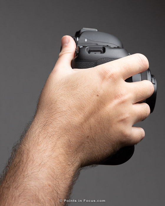
When holding an SLR as you would when shooting, these control hot zones will center on the top of the camera near the shutter release (where the index finger falls), the upper right corner of the back (where the thumb falls), the lens (where the left hand is holding it), and to a lesser used extent the inside of the grip where the finger tips of the index, ring, and pinky fingers are.
On the other hand, controls on the left top plate (top or rear), or the left side of the back, aren’t really easily accessible from the shooting grip position.
The ideal then, is to place controls in these “hot zones” so that the most used ones are the easiest and quickest to access, which Fitts’s law tells us would be the closeted to where the thumb or finger rests naturally.
That said, the biomechanics of the finger can’t be ignored either. Fingers don’t bend laterally equally far. For example, it’s much easier to flex your index finger towards your thumb, than it is to flex it through your middle finger.
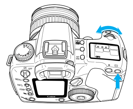
Canon EOS D60 Manual
If we look at this line drawing of the EOS D60 from the Canon manual, we can see the placement of control buttons for metering, drive, and AF modes are well away from the shutter release, making them quite a stretch to reach from the shooting grip. This is arguably poor design, and something that Canon will rectify in their next camera.
That said, Canon also has two easily accessible thumb buttons (lower blue arrow) that allow locking the exposure (✱) and allow selecting the active AF point (indicated button).
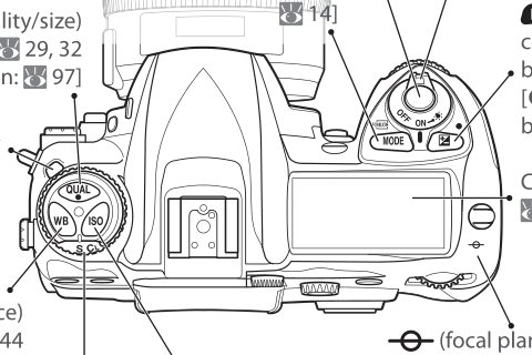 Nikon D200 Manual |
 Nikon D200 Manual |
We can see a similar, though more extensive, groupings of controls in the Nikon D200. On the top plate, there are controls located around the shutter release on the top plate, and controls located around the thumb’s resting position on the back of the camera.
Controls versus Grip Ergonomics
Where the controls are placed on the camera has knock on effects in how the camera is gripped, and from that knock on effects in how the wrist and arms will be bent.
These effects will predominately be driven by the manufacture’s overall control scheme. Though they will also, at least to some extent, be driven by the size of the grip an the camera as well.
This aspect of the ergonomics will be mostly dictated by the placement of controls around the shutter release on the top of the camera.
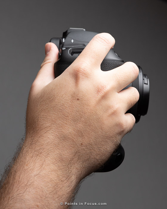
For example, Canon doesn’t place anything controls forward of the shutter release. As a result, when holding the camera, the camera can be gripped so that the index finger is indexed against the middle finger when over the shutter release. This allows a reasonably large range of motion to reach back (towards the thumb). However, it also, for me at least, allows the wrist to be less bent as I’m not trying to rotate my palm so that my index finger can be lower on the grip.
Conversely, Nikon places the sub command dial horizontal across the top of the front of the hand grip. Because its in front of the shutter release it forces you to rotate your grip on the camera so the index finger can land on the command dial. This has to broad impacts. First, since you can only flex your fingers so far, it reduces the effective area that can be used for buttons behind the shutter release. Secondly, it has the effect of causing you to have to bend your wrist laterally as opposed to keeping it more straight.
How much the wrist ends up being rotated does have knock on effects both for comfort, grip retention, and for where controls intended to be used by the thumb can be placed. That said, ultimately how this is going to affect any specific camera and its user is going to vary from person to person and camera to camera.
In the next part, I’ll start in looking at Canon’s early DSLRs. This period largely will cover the transition from film to digital and the changes and challenges that arose in the process of doing that.
Comments
There are no comments on this article yet. Why don't you start the discussion?