Some Thoughts on the Canon Pixma Pro 100
I had the opportunity to spend a bit of time helping a friend setup and test his new Canon Pixma Pro 100. I’ve been printing my own A3+ (13×19 inch) prints for almost 4 years on a Pixma Pro 9000 mark II, so I was interested to see if the Pro 100 was a worth while upgrade to my Pro 9000 mark II; especially given that the printer gets deep rebates quite frequently.
While my primary purpose was to help my friend get settled in with his first pro level photo inkjet, I had my own questions. My big question was whether the Pixma Pro 100 would be enough of an upgrade from my Pro 9000 mark II that I should consider getting one while the rebates are running. Beyond that I really wanted to know how the two grays would preform when printing black and whites compared to the single black in my printer.
Physical
The first thing I can say about the Pro 100 is that it’s noticeably bigger than my 9000 Mk II. I didn’t have them side by side, but I could really see the difference especially when I had a reference like a sheet of paper to compare it to.
Canon has made a number of changes with the Pro 100 in terms of paper handling, I think for the better. On the Pro 9000 mark II the manual paper path is completely flat and fed from the front. The Pro 100 makes the manual paper path more like the auto sheet feeder’s path, that is you load a sheet of paper into an angled tray in the back.
The new system reduces the distance the printer has to be from the wall by some 6 inches, which is defiantly useful. It also simplifies the setup somewhat since you don’t have to raise and lower the front tray, and mess with extending a lot of complicated contraptions on the back. Of course it does also eliminate the perfectly flat paper path of the Pro 9000 mark II.
The other paper handling change in the Pro 100 is that the paper is now centered in the print area, where the Pro 9000 mark II aligned it to the right edge when looking at the front of the printer. This of course, doesn’t make for any real difference in printing, even if you’re printing on both sides of the page, the alignment guides should keep everything in place.
One thing that still is in effect is the hard limit on paper size at 14×26 inches. Certainly this isn’t a common size, but at least some paper manufacturers (Moab for example) will cut paper to custom sizes. In many ways, the 14″ width is already exceptional for a A3+ printer, most are capped at 13 or just slightly more.
The same 26″ limit as the Pro 9000 mk II is a bit more disappointing.
Why? Panoramas. Niche application, I know. But it would have been nice to see a 30 or 40 inch length limit instead of the 26″ one. Epson’s roughly comparable Stylus Photo lines will print up to 13×44 inches. Something to consider if printing panoramas is up your alley and you’re not ready to spend $1200-1800 on a roll fed printer.
Inks
There are two appreciable differences between the Pro 9000 mark II and the Pro 100. The first is the ink formulation. Both printers use dye based inks, though the Pro 9000 mark II uses Canon’s older ChromaLife 100 formulation while the Pro 100 uses Canon’s newer ChromaLife 100+ formulation.
The plus may seem like a minor detail however it’s not. Canon claims that the ChromaLife 100+ inks will be light fast for 30-years, and gas fast for 20-years, along with increasing the dark storage life from 100 years, to 300 years.
Of course, prints don’t just stay perfect then fall off a quality cliff when they hit their estimated lifetimes. In all cases, they’ll fade continuously over time, the difference in expected life time really tells us about how fast we can expect them to fade to some reference level. That is when displayed under the same conditions, we might expect a print from a Pixma Pro 9000 mark II in 5 years to look like what one from the Pro 100 would look like in 15 due to light.
Suffice to say, there are certainly compelling reason to consider upgrading to the new inks if you intend to sell or display prints for a significant amount of time.
One other reason to consider staying with dye based inks, is that the dye ink printers can generally handle lower duty cycles and longer intervals between prints without risking head clogs and either ink consuming self cleaning or more complex and expensive external cleaning or head replacement.
The second change is that the inks colors have been reformulated. Canon claims that the new formulation increases the printer’s color gamut over the previous gen ChromaLife 100 inks. There’s certainly differences in the soft proof tests I’ll cover in a bit that are more than just what you’d expect form losing green and red. The most noticeable difference outwardly is that the green and red inks of the Pro 9000 mark II are gone, and in their place the Pro 100 has light and dark gray inks for black and whites.
Black and White prints
One thing I would point out, in all of these tests, both on my Pro 9000 mark II as well as the Pro 100, no special calibration was preformed, outside of the standard head alignment procedures when setting up the printer. Stock Canon ICC profiles were used for all of these prints. Additionally in the papers used came from the same box (one box of Pro Platinum and one box of Photo Plus Semi-gloss).
The addition of gray inks does seem to make a difference with black and white prints. I printed the same elephant print on both my Pro 9000 mark II and the Pro 100, from the same computer, using the same settings in Canon’s Print Studio Pro application.
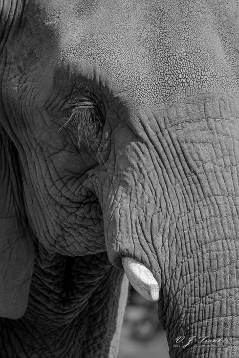
The most noticeable difference between the Pro 9000 mark II and the Pro 100 is in the deep shadow area in the lower left corner. The lack of dark gray inks in the Pro 9000 mark II forces the printer to make the tones with just black and paper white. This appears to compromise certain dark gray tones on the Pro 9000 mark II by rendering them lighter than they should be.
On my elephant test print, the lack of grays on the Pro 9000 mark II seems to have increased the contrast in the shadow area under the elephant’s head, making the lighter areas pop out more. On the Pro 100, that shadow area is distinctly darker over all, with some of the darkest areas almost disappearing into black.
I would say that the Pro 100 print probably more closely represents what I was looking at when I was editing the picture in Lightroom on my calibrated and profiled NEC PA241W-BK.
Fine details look identical between the Pro 9000 mark II and Pro 100 prints, which is to be expected given they’re both the same resolution.
Color Prints
We did make a couple of color test prints, and they did look good so far as I could tell. However, I failed to put together a color test print before embarking on this, so while we ran a couple of color prints when we got the printer setup, I don’t have anything to compare them too. Sadly, this precludes me from making any kind of real commentary on the color capabilities.
Lacking real world tests, I did throw together a quick look in Photoshop at a Granger Rainbow to see how the color gamuts might workout with the loss of the red and green inks. This is certainly not a scientific test, and it relies heavily on the accuracy of Canon’s ICC profiles.
Before I go any further, a brief comment on what this is actually looking at. The Granger Rainbow is a mathematically generated image that contains every possible color and brightness in the visible spectrum as defined by the CIE LAB color space. There are colors here that will NEVER render properly on a computer or printer. In fact, just looking at the chart, you aren’t actually seeing all the colors because your monitor can’t display them.
I’ve taken the Granger rainbows and used the soft proofing capabilities of Photoshop to mask the colors that aren’t in the gamut of the two printers. What we’re most interested in is how much of the color shows through, and more importantly how much of the color shows through in key areas likes skin tones.
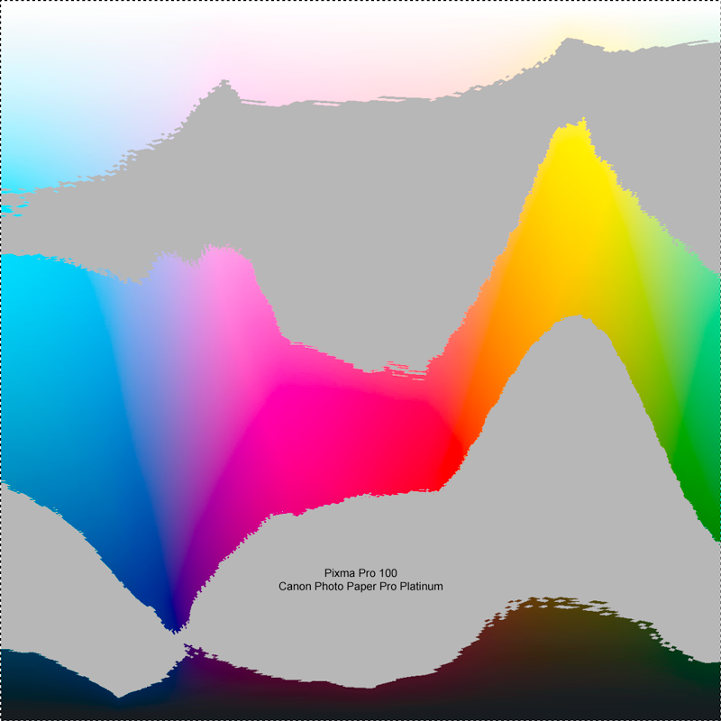
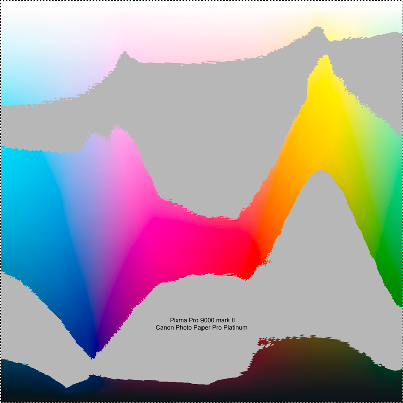
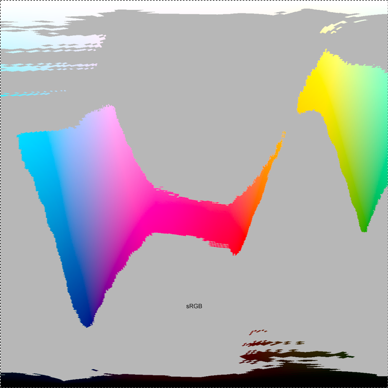
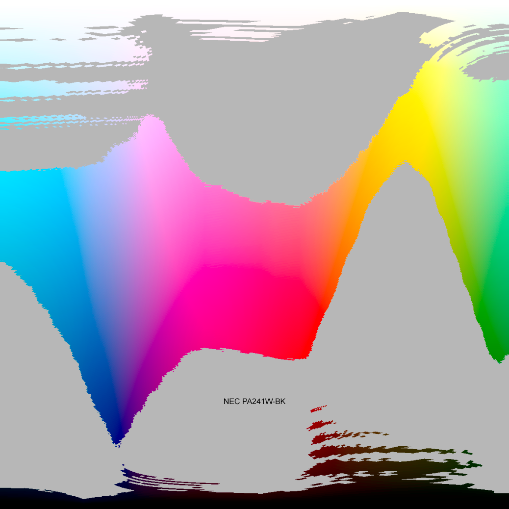
I’ve also included the sRGB gamut as this is what you’re generally limited to when you print your photos through a lab or other service that uses light jet printers.
The first thing that should stand out is just how much more color you get out of either of these printers compared to the sRGB color space. Unless you have a wide gamut display you’re missing out on a lot of what this printer can potentially output. Even with a wide gamut display, you’re still missing out in places.
The difference between the Pro 100 and the Pro 9000 mark II is much more subtle, and in most cases it’s a slight matter of give and take where one printer loses a little at a lighter shade while it gains at a darker shade. The Pro 100 seems to have a slightly expanded gamut in the range of flesh tones, as well as in dark blues. The Pro 9000 mark II seems to do better, at least in theory, in pure greens, and very light blues and yellows. In practice, the prints are going to be very very close, so much so that I certainly wouldn’t go looking for the old Pro 9000 mark II because of any differences in these charts.
Paper – Photo Paper Plus Semi-Gloss
The deal my friend got with the printer included a 50-sheet pack of A3+ sized Canon Photo Paper Plus Semi-Gloss. I’ve only ever really printed on Canon’s Pro Platinum paper and a couple of verities from Moab Paper, so I’m not an expert in what to expect with most Canon papers.
From what I can tell, Canon basically has 3 tiers of paper. On the bottom are the Photo Paper Plus verities (Glossy and Semi-gloss), in the middle are the Photo Paper Pro verities (Premium Matte (PM–101), Luster (LU–101), and Platinum (PT–101)), and on the high-end the fine-art papers. While the Pro 9000 mark II and Pro 100 can certainly print on the fine art papers, and Canon supplies color profiles for them, the best paper you’ll typically use is Pro Platinum.
We also had a sample pack of Canon Photo Paper Pro Luster (LU–101). Both the Pro Platinum and Pro Luster papers rendered colors spot on without any appreciable casts or need for adjustments. The Plus Semi-Gloss (SG–201) was considerably more disappointing, producing a red/magenta cast on every image we printed on it. Though my color sensitivity is neither as trained or as good as my friends, there was enough of a red/magenta cast in the prints on the Plus Semi-Gloss paper that even I could see it right away.
The Plus Semi-gloss also exhibited a marked shift in tonality as it dried, even over a half hour period.
While inkjet prints, at least those on proper paper, come out of the printer dry to the touch, they still need time to fully dry and off gas the remaining solvents. On my typical Pro Platinum paper, the effects of this aren’t especially obvious. I’ve never actually seen a print come out of the printer and “develop” before my eyes so to speak.
With the Plus Semi-Gloss paper, there was a marked and obvious change in the image over a half hour after printing. It was most noticeable again in the shadow on the elephant. When it came out of the printer, it was extremely muddy and very poor looking. Over the course of the following 30 minutes, that area developed much better contrast and tonal separation. I had never seen this before in a print, and certainly not to this extent with the Canon papers I have used, so this is something to keep in mind when using this paper.
All told I was somewhat disappointed bout the Plus Semi-gloss. Maybe I expected too much from it, I’m not sure. But I did expect the prints on it to be more neutral than they were. Even after a couple of days drying, there’s still a very slight warmth to the print that isn’t in the ones on Pro Platinum paper.
Conclusions
All told from the limited time I spent playing with it, the Pro 100 looks like a very solid printer, every bit an incremental step up from the Pro 9000 mark II it replaces. Black and whites look excellent to me. Moreover, the increased resistance to light and gasses certainly makes the inks attractive to me even if it’s not a critical point in my current usage.
The big question though, is would or should you upgrade a Pixma Pro 9000 mark II to a Pro 100?
For me, at least, the answer to that question is no.
Though I could get a Pro 100 for only $150 after rebates right now, it’s just not enough of an improvement in print quality over my Pro 9000 mark II for me to make the jump. I would probably sing a different tune if I printed a lot more black and whites than I currently do, I would also probably consider switching if I printed more heavily but for the work and volume I do, I don’t see a reason to simply upgrade.
Now if my Pro 9000 mark II dies, I would have no hesitation buying a Pro 100 to replace it, and I would be very confident that the prints that come off it would meet or exceed what I’m doing now. But that’s a different situation all together.
Comments
this was extremely thorough and helpful – thank you.
I have the same dilemma and am mostly hesitating because I have so much ink. However after reading this I plan to make the jump and sell the ink on eBay.
Would love to hit an affiliate link through your article but I dont see one for B&H and it doesn’t include the A3+ paper on Amazon
Lastly, I tried finding an article just like this and didn’t after Googling a number of different things. (Pro 9000 vs pixma 100, etc.)
Try adding more tags to your article so others will find it quicker.
Thanks!!
Max,
What I’ve elected to do with my Pixma Pro 9000 mk 2 is run it until I’m out of ink and then replace it with a new printer. Since I’m not buying much in the way of glass anymore, I may even consider moving to a ImagePROGRAF Pro-1000 for a 17″ roll capabilities when the times comes.
Unfortunately, I’m not a B&H affiliate. But I appreciate the gesture of support. For what it’s worth, the way the Amazon associate program works, you don’t have to buy something strictly related to photography. If you’re a regular amazon customer and you go through the affiliate line from here, anything you buy, say a book or a movie or whatever, counts. If not, well, like I said, I appreciate the gesture of support.
As far as finding the article more easily on Google, their search rankings can vary quite a lot from user by user due to all kinds of things. When I do a search for “Pro 9000 vs pixma 100” this article is the 7th result for me, but that doesn’t mean it will be for you. That said, I’m in the process of slowly overhauling a lot of content as I have time to make it easier to find, clearer, and more complete. But that’s a slow undertaking while still researching, testing, and developing new content and actually getting out in the field to make pictures. Anyway, thanks for the heads up.
i’d like to get a monitor for proofing to print on the pixma pro 100. from what i’ve read. the pixma pro 100 only prints to about 60% of Adobe RGB. It doesn’t even cover the full sRGB color space AFAIK. would it then be of any advantage for me to spend money getting a full Adobe RGB gamut monitor like the BenQ SW2700PT over a cheaper 100% sRGB (72% sRGB) monitor like say the LG 27UK850? I see on the forums that people say that it’s better to proof with a ARGB monitor but i don’t understand why that would be the case if the printer can’t even achieve sRGB color space.
Alex,
The problem with saying a device covers X % of a color space, is that it doesn’t tell you what parts of the color space are covered and which parts aren’t. The gamut curves aren’t just simply bigger and smaller than each other, they don’t always completely overlap either.
If you look at the Granger rainbows in the article, there are appreciable areas in the oranges and cyans and greens that the Pro 100 reproduces that aren’t reproduced in the sRGB space.
While it might be strictly true that the Pro 100 only covers 60% of the sRGB color space, my testing indicates that it covers a lot of colors that aren’t in the sRGB space. If you’re only pairing that with an sRGB display, you’re at the mercy of your display when proofing. You can certainly get buy with the sRGB display, but it won’t be ideal and you’ll be relying more on out of gamut warnings for your print proofing than seeing things.
Hope that helps some.